Overview
FLOWFACT is a real estate management platform which provide 360 degree workflow from collecting acquisition, marketing to sale and after sales process. FLOWFACT is part of Scout24 group, the biggest real estate portal in Germany. The USP of FLOWFACT is the flexibility of the platform which allow user to customise all the data and workflow to match with their specific need.
My role
I am the senior UI and UX designer, responsible for 2 more external UI designers. My main goal is
- To standardise and simplified the core product in order to allow other sub-product to extend the functionalities for specific use-case.
- Merging project between Scout manager and FLOWFACT to make sure that Scout user will be satisfied with the new product.
Understanding the problem
In the past FLOWFACT platform has been executed without design and discovery process which make the platform become very complicated. This usability problem lead to low NPS score, low engagement score (based on 5 core functionalities) and higher churn rate from smaller customer in the past years.
I conducted the research plan to gather the insight with both qualitative and quantitative method. The goal is to;
- Understand user’s workflow
- Discover pain points with the existing user journey
- Prioritise the issue
Gathering insights
Internal service team interview
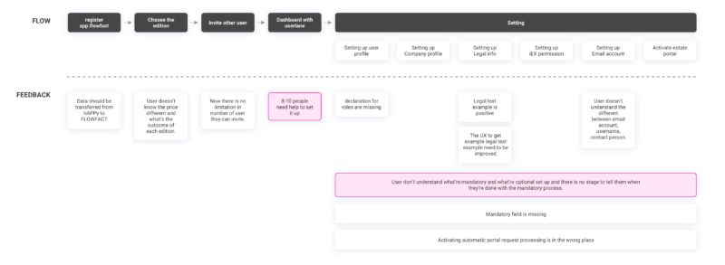
- Onboarding team mentioned that 8 from 10 people couldn’t finish the task by themselves and when they have coaching session it always start with the questions from the customer.
Survey
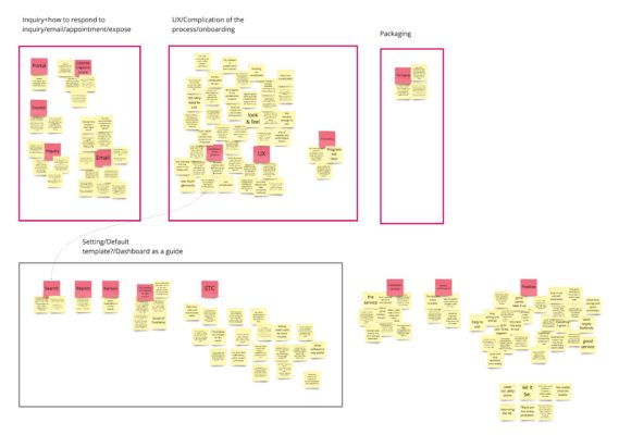
From NPS survey, we received quite low score from the users and also qualitative feedback. I mapped them into topics.
- Majority of the feedback are about complication of the platform.
- Other topics are about Quick search, email functionality, inquiry management, calendar/appointment,
Some of the example feedback from user;
-
Onboarding is weak and hard to use without IT background. I believe that I only know maximum 15% of the system
-
Too much time-consuming and I don’t have time to deal with the seminars for hours. Not self-explanatory
-
Very complicated data entry and management of prospects. No possibility to use interested parties for the desired property search.
User’s interview and usability testing
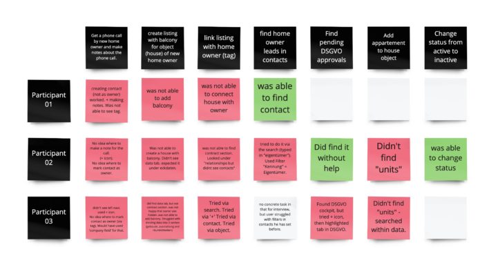
We did usability test with existing product. The red sticky note shows the failed task and green one show that user are able to complete the task. As the result, we found out that user failed most of the tasks.
Data analytics
- 38% of our customers who trying our free trial don’t proceed with the contract.
- 66% of our customers who got the free account from scout have tried FLOWFACT but not actively using it. (Low engagement score)
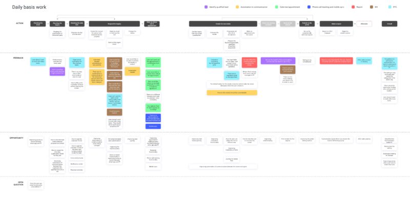
We mapped the problem that user have into the user’s journey
Prioritise the issue
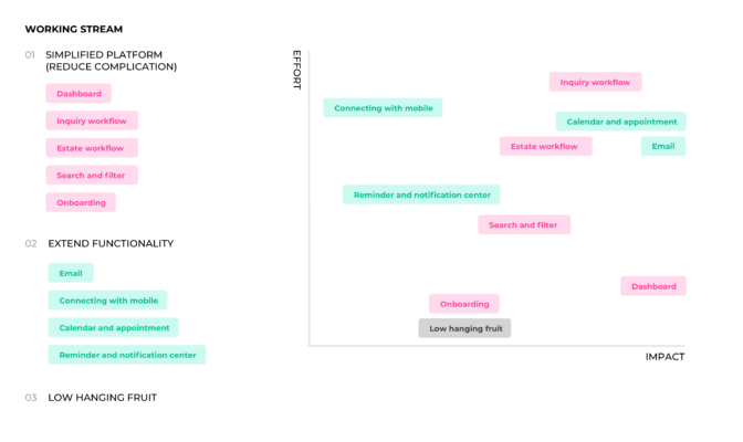
We prioritise the problems based on user’s impact and effort ans separated it into 2 working stream.
- Simplified the platform/existing functionality
- Extend the new functionlities
- Small project/low hanging fruit
Ideation and prototype
Dashboard and onboarding
Problem we would like to solve
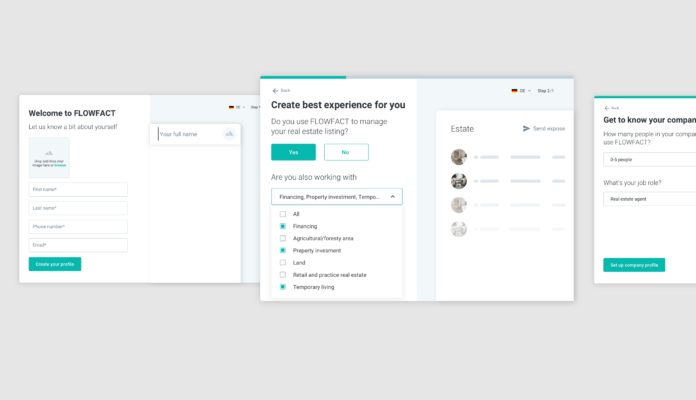
With the high number of users who started trying FLOWFACT but do not continue using the platform, we believe that by improving onboarding process and dashboard will help to;
- Have a completed first set up to make platform ready to use without dealing with complicated setting section.
- Guide user to easily learn about the platform.
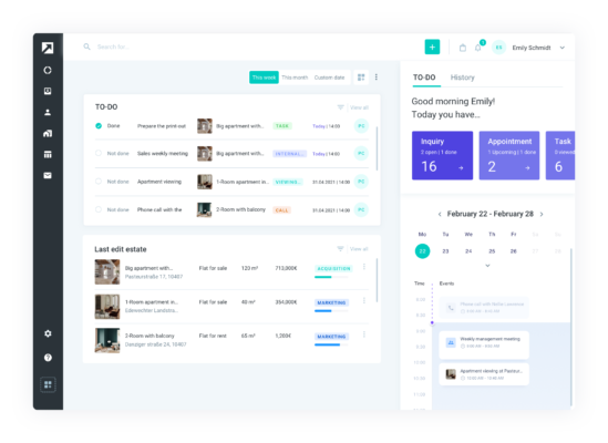
- With the easy entry point to key functionalities from dashboard, it will improve the engagement score.
We have several iteration of the Dashboard that have been continue developed through user testing. I defined MVP and measure the effort together with PM and deverloper.
After we launch the project, we also continue tracked the usage of the dashboard and found out that user does not use the filter inside of the dashboard. So our team decided to removed this functionlity.
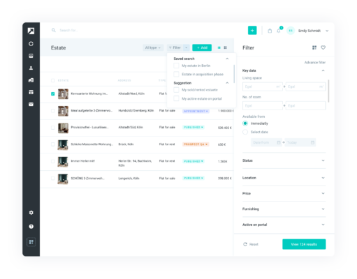
Search and filter
Problem we would like to solve
User should be able to reach the data they are looking for. Existing search engine is too complicated for the user to use. Users mentioned that they will need IT knowledge, in order to be able to use it.
We created 2 alternatives of prototype and and did A/B testing with the users.
Estate management
Problem we would like to solve
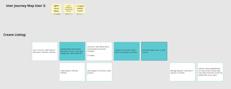
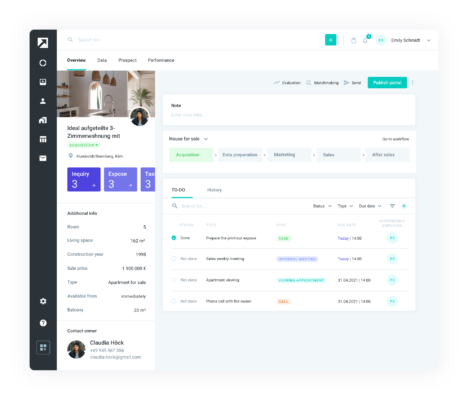
We learned that estate management is the core part that users engage the most. But the data shows that there are many functionalities inside that have not been used. We conducted interview to find out what are journey and key functionlities that they need while working with the estate.
Below is the example note from the the interview;
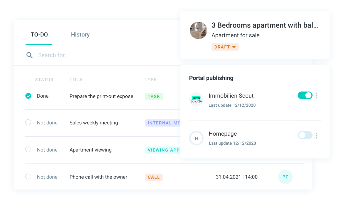
Here are example of the user activities inside of estate section;
- Collecting data from homeowner and create the contract.
- Evaluate the estate price
- Prepare the information and publish to the portal
- Check and respond to the inquiry
Developing process
We have refinement meeting with developer and project manage to clarify all of the question based on Figma design and prototype. I worked closely with front-end developer to solve the problem and we have design QA process to ensure that the design will be rechecked before it’s live.
We also make sure that all the new functionalities need data tracking in order to validate the result and decide on the next milestone.
Validation
- Continue the usability test and user interview after implemented.
- Tracking the engagement score based on 5 core functionalities.
- Tracking number of service ticket requested in onboarding team
